Glacier drawings translate complex ice‑loss data into clear visuals, helping anyone understand the processes, evidence, impacts, and solutions related to melting glaciers worldwide.
Quick Answer
Glacier drawings are schematic or artistic representations that simplify the measurement of glacier retreat and thinning, showing changes over decades in an accessible way. They work by converting satellite, aerial, and field observations into scaled visuals that highlight loss of ice volume, surface area, and elevation. Strong evidence from the IPCC 2021 Assessment Report, long‑term monitoring networks, and peer‑reviewed studies confirms that most glaciers worldwide have been shrinking since the mid‑20th century. The primary impact is reduced freshwater storage, sea‑level rise, and ecosystem disruption, though uncertainties remain about regional rates and future thresholds.
Key Takeaways
- Glacier drawings turn raw measurements into visual stories that reveal ice loss at a glance.
- Multiple lines of evidence—satellite altimetry, gravimetry, and in‑situ surveys—show a consistent global retreat trend.
- Melting glaciers affect sea level, water supply, and downstream ecosystems, with impacts varying by region.
- High‑confidence findings include accelerating mass loss and rising contribution to sea‑level rise.
- Uncertainties involve future melt rates, regional climate feedbacks, and the timing of irreversible thresholds.
- Solutions combine emission reductions, adaptation of water resources, and preservation of high‑altitude refugia.
- Individuals can support climate policies, reduce carbon footprints, and use glacier visualizations for education.
What Is Glacier Drawings That Explain Ice Loss Simply?
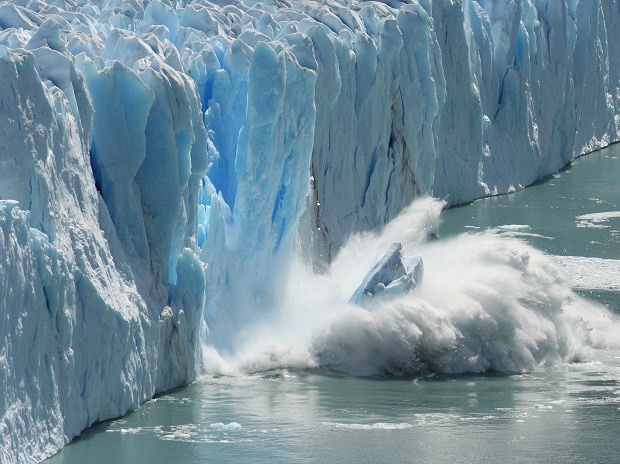
Glacier drawings are simplified visual representations—often line sketches, color‑coded maps, or time‑lapse illustrations—that depict changes in glacier size, thickness, and terminus position over time. They differ from technical maps or raw data tables by emphasizing clarity over precision, making them useful for classrooms, media, and public outreach. The term encompasses hand‑drawn sketches, computer‑generated graphics, and infographic‑style panels that compare historical photographs with recent observations. Their purpose is to communicate the magnitude of ice loss without requiring specialized knowledge of glaciology.
How Does It Work?
Data Collection
Scientists gather glacier measurements using satellite radar (e.g., ESA’s CryoSat‑2), laser altimetry (ICESat‑2), aerial photography, and ground‑based GPS surveys. These data provide three key variables: surface elevation change, horizontal retreat, and volume loss.
Data Translation
Collected numbers are converted into visual elements:
- Scale the glacier outline to a consistent map projection.
- Apply color gradients to indicate thickness change (e.g., blues for thinning, whites for stable ice).
- Overlay sequential outlines to show retreat over decades.
- Include annotations such as years, elevation markers, and reference points.
Communication Loop
Artists or graphic designers work with glaciologists to ensure scientific accuracy while enhancing readability. The final drawing is then distributed through educational materials, news outlets, and museum exhibits, prompting public discussion and policy awareness.
What Does the Evidence Show?
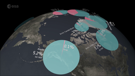
Long‑term monitoring indicates that from 1961 to 2020, the global glacier inventory lost an average of 0.5 meters of water equivalent per year, equivalent to roughly 267 Gt of ice per year (World Glacier Monitoring Service, 2021). Satellite gravimetry from the GRACE mission corroborates this loss, showing a cumulative contribution of about 0.8 mm to global sea level per year (IPCC, 2021). Regional studies, such as those in the Himalaya, report retreat rates up to 30 m per decade, while Antarctic Peninsula glaciers have thinned by more than 100 m in some basins (NASA, 2020). Across all data sources, the trend is consistent: glaciers are losing mass at an accelerating pace.
Main Causes or Drivers
Direct Climate Forcing
Rising atmospheric temperatures increase surface melt, while warmer oceans enhance basal melting of tide‑water glaciers. The IPCC attributes over 80 % of observed glacier mass loss since the 1990s to anthropogenic warming.
Feedback Mechanisms
Albedo feedback—where darker ice exposed by melt absorbs more solar radiation—amplifies local warming. Additionally, reduced glacier runoff can alter regional precipitation patterns, creating a secondary feedback loop.
Human Activities
Emission of greenhouse gases from fossil‑fuel combustion, deforestation, and industrial processes drives the temperature rise that underpins glacier melt. Local black‑carbon deposition on glacier surfaces can also accelerate melt in high‑traffic mountain areas.
Environmental and Human Impacts
Environmental Impacts
- Sea‑Level Rise: Melting glaciers contributed about 0.25 mm per year to global sea level between 2003‑2019 (IPCC, 2021).
- Freshwater Availability: Seasonal meltwater supply to rivers such as the Indus, Ganges, and Colorado is declining, threatening agriculture and ecosystems.
- Ecosystem Shifts: Cold‑water habitats shrink, affecting species like the glacier ice‑worm and cold‑adapted fish.
Human Health and Social Impacts
- Reduced meltwater can increase water scarcity for millions downstream, raising risks of conflict over water resources.
- Glacier‑fed flood peaks may become more erratic, heightening disaster risk for communities in river valleys.
- Loss of iconic glaciers affects cultural identity for Indigenous peoples whose traditions reference glacial landscapes.
Economic and Infrastructure Impacts
- Hydropower generation dependent on stable glacier melt may face reduced capacity, affecting energy security.
- Tourism centered on glacier viewing experiences suffers as ice retreats, impacting local economies.
Regional Differences
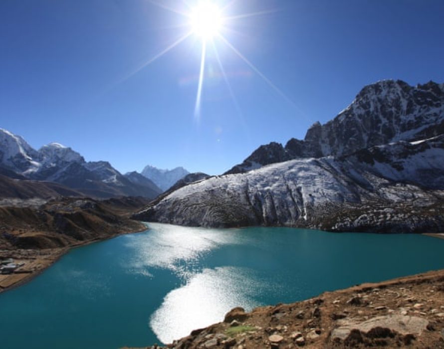
Glacier response varies with climate regime and topography. In the High Andes, glaciers have retreated up to 40 % of their area since the 1990s, driven by strong warming and reduced precipitation. In contrast, some Karakoram glaciers show limited change—a phenomenon termed the “Karakoram anomaly”—likely linked to localized cooling and increased winter snowfall. Polar regions exhibit complex patterns: Antarctic Peninsula glaciers retreat rapidly, while interior East Antarctic ice remains relatively stable, though recent satellite data suggest emerging thinning in some basins.
What Scientists Know With High Confidence
- Global glacier mass has been decreasing continuously since at least the 1960s.
- Anthropogenic greenhouse‑gas emissions are the dominant driver of recent glacier melt.
- Glacier loss contributes measurably to global sea‑level rise.
- Albedo feedback accelerates melt where surface ice is exposed.
What Remains Uncertain
Key uncertainties include the precise timing of threshold crossings that could trigger rapid, irreversible retreat in certain mountain ranges, the extent of future precipitation changes in high‑altitude basins, and the interaction between glacier melt and regional monsoon dynamics. Improved high‑resolution monitoring and climate‑model coupling are needed to narrow these gaps.
Common Misconceptions
Misconception: Glaciers Only Melt in Summer
Reality: Glaciers lose mass year‑round through surface melt, sublimation, and basal melting driven by ocean temperatures, especially for tide‑water glaciers.
Misconception: All Glaciers Are Melting at the Same Rate
Reality: Retreat rates differ widely; tropical glaciers can vanish within decades, while some high‑latitude ice caps lose mass more slowly.
Misconception: Glacier Drawings Are Pure Art, Not Science
Reality: Effective glacier illustrations are grounded in quantitative data; they serve as a bridge between rigorous measurements and public understanding.
Solutions and Limitations
Mitigation requires rapid reduction of CO₂ emissions; models show that limiting warming to 1.5 °C could halve projected glacier loss by 2100 (IPCC, 2021). Adaptation measures include developing diversified water‑storage infrastructure, early‑warning flood systems, and protecting glacier‑fed wetlands. Conservation of high‑altitude ecosystems can preserve refugia for cold‑adapted species, but such actions cannot stop melt without broader climate action. Technological options like artificial snowmaking or glacier “re‑grooming” have limited scalability and may have unintended ecological impacts.
What Individuals, Communities, and Governments Can Do
What Individuals Can Do
- Support policies that price carbon and fund renewable energy.
- Reduce personal carbon footprints through energy efficiency, low‑carbon transport, and sustainable consumption.
- Use glacier drawings in local schools or community workshops to raise awareness.
What Communities and Organizations Can Do
- Implement integrated water‑resource management that accounts for declining glacier contributions.
- Develop climate‑resilient tourism strategies that diversify income beyond glacier viewing.
- Partner with research institutions to monitor local glaciers and share updated visualizations.
What Governments Can Do
- Adopt and enforce ambitious Nationally Determined Contributions (NDCs) aligned with the Paris Agreement.
- Invest in high‑resolution remote‑sensing networks and open‑access glacier databases.
- Incorporate glacier‑change scenarios into land‑use planning, disaster risk reduction, and water‑allocation policies.
Closing Synthesis
Glacier drawings distill complex, multi‑decadal observations into images that reveal a clear story: glaciers worldwide are losing ice at an accelerating pace, driven chiefly by human‑induced warming. The evidence is robust, while uncertainties focus on regional specifics and future thresholds. Mitigation, adaptation, and conservation together offer the most effective pathway to safeguard water resources, ecosystems, and cultural values tied to these icy giants. By translating data into visual language, these drawings empower informed decision‑making at every scale—from individual classrooms to international policy arenas.
Frequently Asked Questions
What are glacier drawings and why are they useful?
Glacier drawings are simplified visual representations that turn measured changes in glacier size and thickness into clear images. They help people understand complex melt data without needing technical expertise.
Which scientific evidence confirms that glaciers are losing mass?
Long‑term records from the World Glacier Monitoring Service, satellite gravimetry (GRACE), and the IPCC 2021 Assessment Report all show consistent global glacier mass loss since the 1960s.
How does glacier loss affect freshwater supplies?
Melting glaciers reduce the seasonal meltwater that feeds rivers such as the Indus, Ganges, and Colorado, threatening agricultural irrigation, drinking water, and ecosystem health for millions downstream.
What are the main uncertainties about future glacier change?
Key unknowns include the timing of rapid‑retreat thresholds, how precipitation will change in high‑altitude basins, and the interactions between glacier melt and regional climate patterns.
What actions can governments take to address glacier melt?
Governments can set ambitious carbon‑reduction targets, fund high‑resolution monitoring networks, and integrate glacier‑change scenarios into water‑resource planning, disaster risk reduction, and land‑use policies.




Leave a Comment