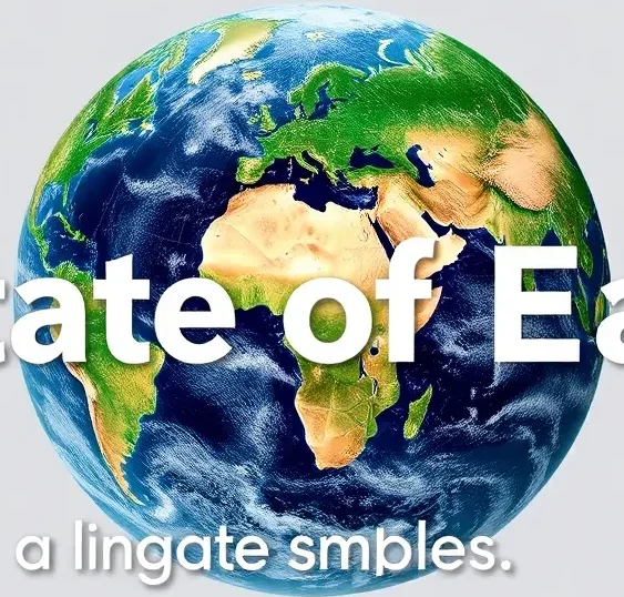
Visuals such as glacier retreat photos, urban heat maps, and coral bleaching time‑lapses translate complex climate science into clear, compelling stories that help people grasp causes, impacts, and solutions.
Quick Answer
Climate‑change imagery captures observable shifts in the Earth system—melting ice, altered weather patterns, and ecosystem stress—by documenting measurable changes over decades. These images are grounded in satellite monitoring, long‑term field observations, and peer‑reviewed analyses, showing that rising greenhouse‑gas concentrations are driving global warming. The most significant implication is that visual evidence makes abstract data tangible, motivating public awareness and policy action, while acknowledging that precise future trajectories depend on emissions scenarios.
Key Takeaways
- Photographic records of glaciers, sea‑level rise, and extreme events provide direct, observable proof of climate change.
- Satellite‑derived heat‑island maps and ocean‑acidification graphics illustrate how human activities amplify natural processes.
- Scientific confidence in these visual trends is high, based on multiple independent monitoring networks.
- Uncertainties remain around regional climate feedbacks and the speed of ecosystem responses.
- Effective responses combine mitigation, adaptation, and communication strategies that leverage visual storytelling.
What Is The Best Images That Visually Explain Climate Change?
The phrase refers to a curated set of photographs, maps, and time‑lapse visualisations that clearly demonstrate the physical manifestations of a warming planet. Scope includes satellite imagery, aerial photography, ground‑based time‑lapse series, and colour‑coded maps that link observable changes to underlying climate processes. Unlike generic “climate‑change pictures,” these images are selected for scientific relevance, temporal depth (often spanning decades), and ability to illustrate cause‑effect relationships. They matter because visual cognition often outperforms textual information in shaping public perception and policy support.
How Does It Work?
1. Data Collection and Imaging
Remote sensors on satellites (e.g., NASA’s Landsat series) capture reflected sunlight across spectral bands, enabling measurement of ice extent, vegetation greenness, and surface temperature. Ground cameras record time‑lapse sequences of glaciers or coral reefs. Aerial drones provide high‑resolution views of deforestation fronts. All data are georeferenced, calibrated, and archived for repeatability.
2. Processing and Visualisation
Raw measurements are converted into colour‑coded maps (e.g., red‑yellow for hotter urban zones) or composite images that highlight change over time. Statistical algorithms subtract baseline values (often 1981‑2010 averages) to reveal anomalies. Time‑lapse videos compress decades of change into seconds, making trends instantly perceptible.
3. Interpretation and Communication
Scientists annotate images with scale bars, timestamps, and reference locations. Communicators pair visuals with concise captions that explain the underlying physics—such as how higher atmospheric CO₂ traps infrared radiation, leading to glacier melt. The resulting package bridges technical evidence with public understanding.
What Does the Evidence Show?
Long‑term monitoring by the Intergovernmental Panel on Climate Change (IPCC) Sixth Assessment Report (2021) confirms that global average surface temperature has risen about 1.1 °C above pre‑industrial levels, a trend evident in satellite‑derived heat‑island maps and glacier‑extent photographs. NASA’s Earth Observatory documents that the Greenland Ice Sheet lost an average of 279 Gt of ice per year between 2002 and 2020, visible in side‑by‑side glacier photos. Ocean‑acidification graphs, derived from the Global Ocean Data Analysis Project, show a 0.1 pH unit decline since the 1950s, mirrored by widespread coral‑bleaching imagery. Extreme‑event composites—such as Hurricane Ida’s 2021 satellite track overlaid on historic storm paths—illustrate increasing frequency and intensity, consistent with attribution studies published in *Nature Climate Change* (2020). Together, these visual data streams converge on a single conclusion: the Earth’s climate system is changing in ways that are observable, measurable, and accelerating.
Main Causes or Drivers
Direct Human Drivers
- Combustion of fossil fuels releases CO₂, methane, and nitrous oxide, enhancing the greenhouse effect.
- Land‑use change (deforestation, urban expansion) reduces carbon sinks and creates urban heat islands.
- Agricultural practices emit methane from livestock and rice paddies, and nitrous oxide from fertilisers.
Amplifying Natural Factors
- Solar variability has a minor influence compared with anthropogenic forcing (IPCC, 2021).
- Natural climate oscillations (e.g., El Niño‑Southern Oscillation) modulate short‑term temperature and precipitation patterns, but do not drive the long‑term warming trend.
Environmental and Human Impacts
Environmental Impacts
- Accelerated glacier melt contributes to sea‑level rise, threatening low‑lying coastal ecosystems.
- Ocean acidification impairs calcifying organisms, reducing biodiversity on coral reefs.
- Shifts in precipitation patterns exacerbate droughts in arid regions and increase flood risk in humid zones.
- Heat‑island effects raise urban temperatures up to 5 °C above surrounding rural areas, stressing trees and infrastructure.
Human Health and Social Impacts
- Heatwaves increase mortality risk, especially among the elderly and outdoor workers (WHO, 2021).
- Changing disease vectors expand the range of mosquito‑borne illnesses such as dengue.
- Food security is challenged by reduced crop yields in heat‑stressed regions.
- Displacement pressures rise as sea‑level rise inundates coastal communities.
Economic and Infrastructure Impacts
- Storm‑related damages in the United States averaged $70 billion per year between 2015‑2020 (NOAA, 2022).
- Infrastructure built on permafrost faces increased maintenance costs as thaw destabilises foundations.
Regional Differences
High‑latitude regions experience the fastest temperature rise—approximately 2 °C per decade in parts of the Arctic—leading to dramatic sea‑ice loss observable in satellite images. Tropical regions, while warming more slowly, face heightened precipitation variability, intensifying flood and landslide hazards. Small island developing states confront sea‑level rise that threatens entire nations, a reality captured in shoreline retreat photographs from Kiribati and the Maldives. Conversely, some inland areas of the United States see amplified urban heat‑island effects due to extensive concrete surfaces, illustrated by city‑scale temperature maps. These patterns reflect the interplay of geography, land‑use, and socioeconomic capacity for adaptation.
What Scientists Know With High Confidence
- Human activities are the dominant cause of observed global warming since the mid‑20th century.
- Global surface temperature has risen about 1.1 °C above pre‑industrial levels.
- Glacier retreat, sea‑level rise, and increased frequency of extreme heat events are unequivocal indicators of climate change.
- Continental‑scale heat‑island effects are measurable and exacerbate health risks in cities.
What Remains Uncertain
Key uncertainties centre on regional climate feedbacks, such as the magnitude of permafrost carbon release and the exact thresholds at which major ice‑sheet destabilisation may accelerate sea‑level rise. Cloud‑feedback mechanisms in climate models also contribute to a spread of projected warming scenarios. Improved high‑resolution monitoring and longer observational records are needed to narrow these gaps.
Common Misconceptions
Misconception: A single hot summer proves climate change.
Reality: Individual weather events are influenced by natural variability; however, long‑term trends captured in multi‑decadal temperature maps and heat‑wave frequency graphs provide robust evidence of a warming climate.
Misconception: Only polar regions are affected.
Reality: While the Arctic warms fastest, visual evidence shows impacts worldwide—from coral bleaching in the tropics to increased wildfire intensity in temperate zones.
Misconception: Renewable‑energy photos mean the problem is solved.
Reality: Solar‑panel and wind‑turbine images illustrate progress, yet scaling renewable infrastructure to replace fossil fuels remains a major technical, economic, and policy challenge.
Solutions and Limitations
Effective climate response combines mitigation (reducing greenhouse‑gas emissions), adaptation (preparing for unavoidable changes), and conservation (protecting carbon sinks). Mitigation strategies such as rapid decarbonisation of electricity grids have strong evidence for reducing atmospheric CO₂, but require substantial investment, grid upgrades, and policy alignment. Adaptation measures—e.g., constructing flood‑resilient infrastructure—can lower vulnerability but do not address the root cause of warming. Conservation of forests and wetlands sequesters carbon, yet land‑use conflicts and illegal logging limit effectiveness. Each approach carries trade‑offs: large‑scale renewable deployment may require land that competes with agriculture, and geoengineering concepts remain experimental with unknown ecological side‑effects.
What Individuals, Communities, and Governments Can Do
What Individuals Can Do
- Reduce household energy use by upgrading insulation and adopting efficient appliances.
- Choose low‑carbon transportation options, such as public transit, cycling, or electric vehicles where feasible.
- Support policies and candidates that prioritize climate‑action funding.
- Share credible visual resources (e.g., IPCC graphics) to raise community awareness.
What Communities and Organizations Can Do
- Implement local climate‑resilience plans that incorporate heat‑island mitigation (e.g., tree planting, reflective roofs).
- Develop community‑owned renewable projects to reduce reliance on fossil fuels.
- Partner with schools to use visual climate data in curricula, fostering early scientific literacy.
What Governments Can Do
- Set ambitious, legally binding emissions‑reduction targets aligned with the Paris Agreement.
- Invest in national monitoring networks that provide high‑quality satellite and ground‑based imagery.
- Provide subsidies and regulatory frameworks that accelerate clean‑energy deployment while ensuring equitable access.
- Integrate climate‑risk mapping into urban planning to address heat‑island and flood vulnerabilities.
Closing Synthesis
Visually compelling images—glacier retreats, heat‑island maps, coral bleaching time‑lapses—translate complex climate data into intuitive evidence that underscores human influence on the Earth system. Robust scientific monitoring confirms these trends with high confidence, while uncertainties remain around regional feedbacks and future thresholds. Solutions that blend rapid mitigation, strategic adaptation, and ecosystem conservation offer the most credible path forward, though each carries practical limitations. By leveraging visual storytelling alongside evidence‑based policy, societies can foster informed action that safeguards the planet for future generations.
Frequently Asked Questions
What types of images best illustrate climate change?
Photos of retreating glaciers, satellite heat‑island maps, time‑lapse coral bleaching, and before‑after deforestation aerial shots are the most effective because they show measurable, long‑term changes linked to climate drivers.
How do scientists verify that visual changes are caused by climate change?
Scientists compare images with long‑term monitoring data, such as satellite temperature records and ice‑mass balance measurements, and use attribution studies that isolate human‑induced warming from natural variability.
Are the visual trends shown in images consistent worldwide?
Yes, global datasets from agencies like NASA and the IPCC confirm that glacier loss, sea‑level rise, and increased heat‑island intensity occur across continents, though the rate and local impact can vary by region.
What uncertainties remain about the future visual impacts of climate change?
Key uncertainties involve how quickly permafrost carbon will be released, the exact tipping points for ice‑sheet collapse, and regional cloud‑feedback effects, all of which affect future visual signatures.
How can individuals use climate‑change images to drive action?
By sharing credible, science‑backed visuals on social media, supporting community climate projects, and advocating for policies that fund monitoring and mitigation, individuals can turn images into catalysts for change.









Leave a Comment